Background
Hasn’t this been done before?
Yes, this story has been told before, and all inspiration goes to Dave Wasserman - he is a great follow on Twitter.
If you are an election night junkie like myself, you may have seen tweets like the one below, or read the related article from the NYT’s Upshot (Potential Paywall)
Here's the breakdown of Whole Foods/Cracker Barrel counties won by past new presidents (all based on today's store locations):
— Dave Wasserman (@Redistrict) December 8, 2020
1992: Clinton 60% WF, 40% CB = 20% gap
2000: Bush 43% WF, 75% CB = 32% gap
2008: Obama 78% WF, 36% CB = 42% gap
2016: Trump 22% WF, 74% CB = 52% gap
So what are you doing differently?
Dave Wasserman in his analysis only observed counties with a Cracker Barrel, Whole Foods, or both within their boundaries. His analysis only applies to less than half of Americans who live in a county with either of these restaurants, according to FiveThirtyEight:
44.8 percent of voters live in counties with a Cracker Barrel and 44.5 percent live in counties with a Whole Foods
Additionally, he only labeled the counties as Democratic or Republican based on the majority of the two-party vote.
This leaves an opportunity to expand on Wasserman’s analysis by getting the partisan lean for the entire US. Additionally, by expanding outside of the framework of counties we can then answer the following questions:
- What happens if I don’t live in a county with either of these locations of interest?
- Does living 200 miles from both restaurants say the same about your neighborhood as living 20 miles away from each?
- If I’m close to a Whole Foods, does it matter how close I am to a Cracker Barrel?
- What is the partisan lean of my area (D+5)?
Methods
Estimating Neighborhood Election Results with County-Level Data
We cannot estimate every city blocks’ election results, so we need to break the US into a reasonable number of pieces, instead of the 1.5 billion city blocks that could fit into the US.
Instead, we will break the US into many hexagons that are ~100 sq. miles, or the size of Sacramento or Milwaukee. To do this we will use the python package H3, Uber’s “Hexagonal Hierarchical Spatial Index”, but don’t get bogged down by that scary title. We are only using this as a way to split parts of the US into a bunch of hexagons. Once we have our hexagons we will aim to understand:
- The hexagon’s election results, estimated based on the 3 closest counties
- The distance to the closest Whole Foods and Cracker Barrel from the center of the hexagon
The inspiration for these city-sized hexagons is that county-level data is a pretty crude aggregation of data. As you can see in the visualization below, counties are spread out very unevenly and far apart throughout the US. To map the county results to our hexagons, we’ll take a weighted average (using distance and total votes) of the voting results from the three closest counties.
Calculate Partisan Lean
To calculate this Democratic % of the vote, we will need a formula of how to weigh the nearby votes. From an intuitive point of view, I wanted to increase the weight of counties that are closer and have more votes. To do this, I used the following method for each nearby county centroid:
- Calculate the below and sum for the three closest counties:
RepVotes = CountyRepVotes / CountyDistanceAway
DemVotes = CountyDemVotes / CountyDistanceAway
- Get the estimated Democratic % of the vote:
DemPct = DemVotes / (DemVotes + RepVotes)
Implementing this formula gives us the below:
Now that we have the partisan lean for each hexagon, we need to understand how far away each of these hexagons is from our two points of interest.
Get Cracker Barrel and Whole Foods Locations
What should be simple often ends up being the most time-consuming. After looking into Foursquare and Google Maps APIs, I became frustrated with vague pricing and a 1 request/second limit. Also, both APIs had a search radius of 50km. I finally landed on TomTom since it allowed for an easy fuzzy search and had no radius with a limit of 100 results. This allowed for only having to run a search for Whole Foods or Cracker Barrel across 756 spread out coordinates in the continental US. The alternative was paying a whopping $65 for Cracker Barrel data.
Results
Data Exploration
So what did we find? Well, we already knew from the Wasserman tweet above that there is a correlation between these places of interest and partisan lean. Let’s keep it simple first, and look at the univariate (one-variable) relationship between distance from these locations and how democratic they are.
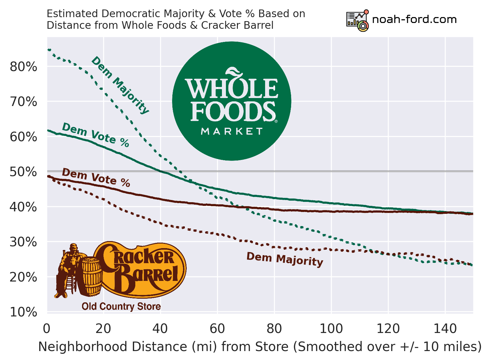
The differences between the solid and dotted lines are important and explained below:
- Solid
- The percent of neighborhoods this far away were majority Democratic.
- Dotted
- What percent of voters in these neighborhoods voted Democratic.
- What Wasserman used in his analysis, but with counties instead of neighborhood-sized areas.
So for example, neighborhoods 20 miles away from WF are majority democratic ~72% of the time. For the other statistic, in an average neighborhood 20 miles away from WF, ~57% of the two-party voters voted Democrat. See the difference?
Whole Foods is associated with being more Democratic, and Cracker Barrel more Republican. Although, if you are at a Cracker Barrel, the average local area voted ~48% Democratic, a moderate value.
If there was a one-liner that I had to take away from this whole analysis, it would be that a 45-mile radius around a Whole Foods is Democratic territory. Additionally, if you are standing in a Whole Foods, there is a ~85% chance you are in a Democratic-majority city-sized area.
Below is a video of an expanding radius around every Whole Foods in the US, with a color layer based on our partisan-lean calculation.
While Dave Wasserman’s hypothesis has been confirmed, what about the bi-variate relationship? What happens if I live next door to Whole Foods but 150 miles away from Cracker Barrel? Using the graph above, it would tell you there is either an 85% chance or a 25% chance that my area is majority Democratic, which is not exactly useful…
For this reason, I plotted the bi-variate relationship for the two mentioned statistics on the heatmaps below.
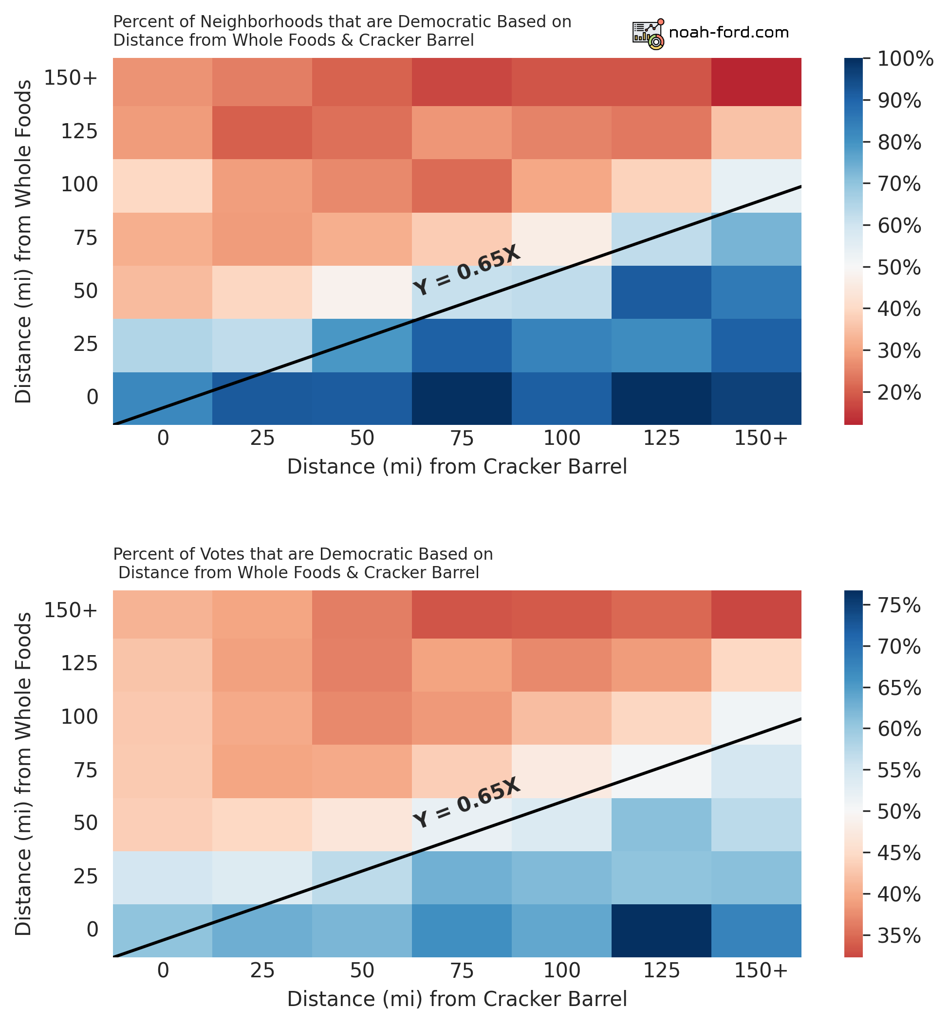
Note the difference between color scales.
Again the distinction between the two stats:
- Top
- % of areas that voted majority Democratic
- Bottom
- % of Voters within the area that voted Democratic
Right away we see a strong correlation, and there is a border of moderation (50/50 Dem/Rep split) when the ratio between Whole Foods and Cracker Barrel distance is 0.65, or in other words a line at Y = 0.65X in both graphs. So on your next date, if you want a politically moderate significant other, make sure to ask them right away:
Do you live 35% closer to a Whole Foods than a Cracker Barrel?
If they say yes, they’re a catch with solid geospatial awareness.
Modeling
Now that we understand the data well, let’s measure how well different models can predict a hexagon’s partisan lean with only Cracker Barrel and Whole Foods proximity.
For simplicity’s sake we will only be predicting if the hexagon is a democratic majority or not, not % Democratic vote or other regression-based predictions.
We will be using three different types of models and comparing their effectiveness:
- Logistic Regression - Most common and simple classification model
- XGBoost - Fancy tree-based ML model that is very common in the data science workspace
- Heuristic, informed from our analysis thus far - Predict “Democrat” if within 100 miles of a Whole Foods
Comparing Models
To compare models, we need to have apples-to-apples metrics that can be utilized to say which model is better in what way. The two metrics we will use are:
- Balanced Accuracy
- Receiver Operating Characteristic, Area Under Curve
Balanced Accuracy
Why not just use accuracy?
In the world of Data Science accuracy is a very flawed and misleading metric. Take the example of predicting who will win the next Powerball lottery, for every person with a ticket we guess “they won’t win” as opposed to “they will win” and we’ll be right 99.999999657% of the time according to this blog.
So how does balanced accuracy fix this issue of class imbalance, where 292 million don’t win and one person does? Essentially, it challenges the model to make predictions on a room full of people where there are equal amounts of lottery winners and losers in it. Now the model needs to have true strength to be right more than 50% of the time.
To better demonstrate balanced accuracy, picture a game show where over and over again a Democratic neighborhood and a Republican neighborhood are placed behind random large doors. All the participants in the game show know are each of the neighborhoods’ distance from Whole Foods and Cracker Barrel. With this info, Logistic Regression, XGBoost, and “Is the neighborhood within 100 miles of WF?” models would be correct 64%, 63%, and 67% of the time respectively. This info is also shown in the graphic below.
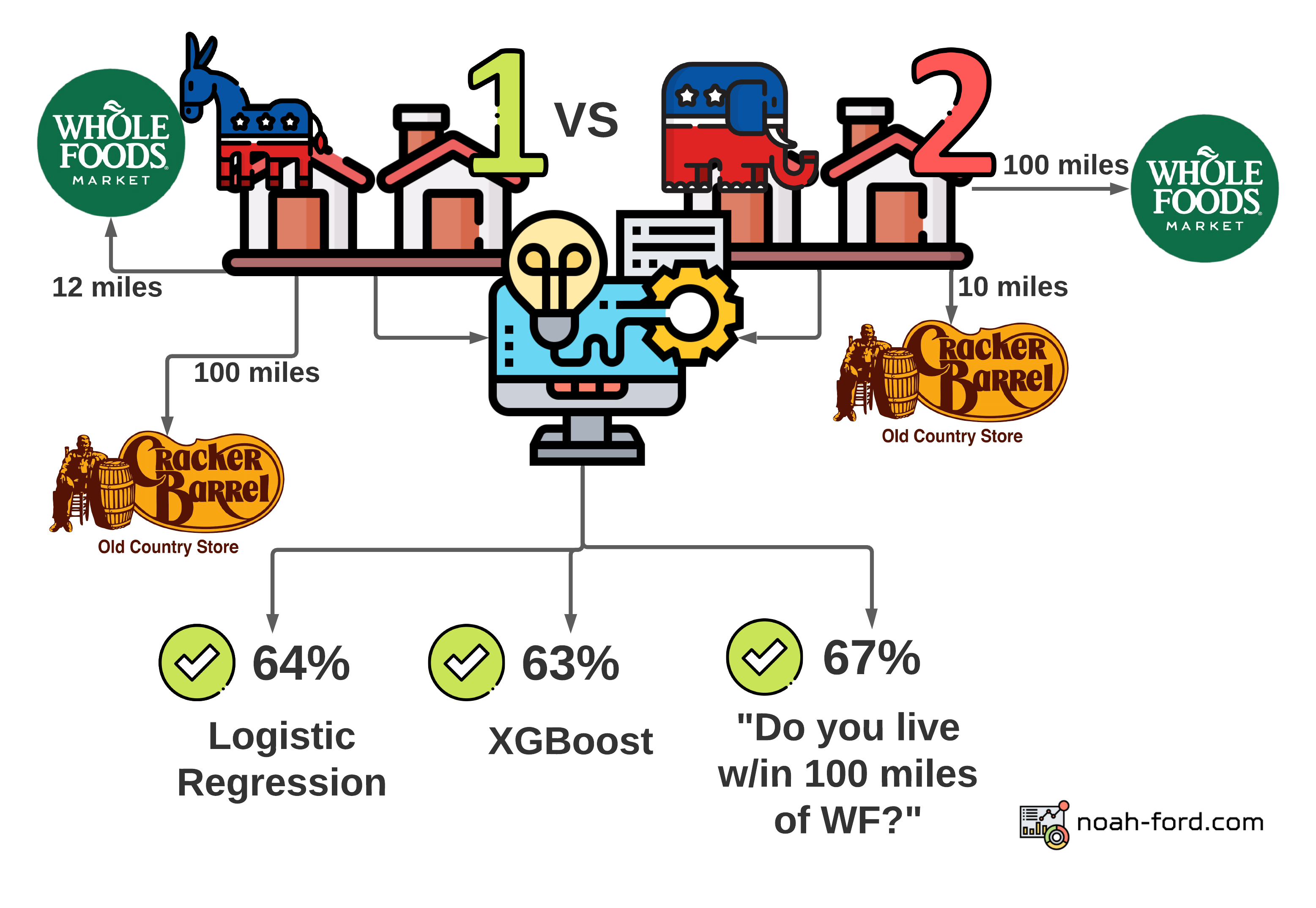
This is quite surprising since such a simple question that isn’t a complex model would be the winner of this very odd game show! Although this statistic and graphic doesn’t paint the whole picture. The simple question model sees a neighborhood 39 miles from a Whole Foods and 150 miles from a Cracker Barrel as the same as one that is 1 mile from a Whole Foods and 200 miles from a Cracker Barrel. In both cases, the model guesses with 100% confidence that both neighborhoods are democratic, even though they are very different neighborhoods. This lack of granularity in this overly simple model can be shown by observing what is called the ROC AUC curve.
ROC AUC
| Actual ⬇️ / Predicted ➡️ | Positive (Dem) | Negative (Rep) |
|---|---|---|
| Positive (Dem) | True Positive | False Negative |
| Negative (Rep) | False Positive | True Negative |
The most commonly used statistic in my day-to-day work is Receiver Operating Characteristic (ROC), Area Under the Curve (AUC). In short, it tells how well your model is at differentiating between classes, or in this case Republican and Democratic neighborhoods.
Our models are all around 0.6-0.7 ROC AUC, meaning they are similar to the image below, where at high confidence levels True Positives greatly outnumber False Positives, but things start to get murky at middle thresholds.
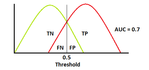
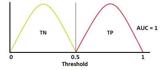
A perfect model on the other hand would look like below, where every time our guess is above 0.5 it is Whole Foods and below 0.5, Cracker Barrel. It is extremely unlikely to get an AUC of 1.0 (100%) and in my current problem space of healthcare, an AUC of 0.8 or higher is a solid model worthy of production.
Below is the ROC AUC curve for each of our models. At each threshold (starting 100% confident that a neighborhood is Democratic and going all the way down to 0%) the curve shows the true positive rate vs the false positive rate. A model that was guessing would just be a straight diagonal line that splits the graph in half. So each of our models is better than just guessing, but the more complex ones are better at making confident and bold guesses (ex. “90% confident that a neighborhood is democratic if it is next door to Whole Foods and far from a Cracker Barrel”).
When plotting ROC on a curve, the goal is to get the highest area under the curve. When hovering over the lines in the visualization below, you’ll see the threshold (% estimate that the hexagon is Democratic), and the true positive and false positive rate at that point.
| Balanced Accuracy | ROC AUC | |
|---|---|---|
| XGBoost | 64% | 75% |
| Logistic Regression | 63% | 73% |
| <=100 miles from WF | 67% | 67% |
Conclusion
We smoothed county-level election data across the US with the help of hexagons, found the closest Cracker Barrel and Whole Foods, and used this info to predict each region’s likelihood of being Democratic.
The heuristics we developed (<100 miles from WF) were rather performant and understandable, but the more complex models were able to place their confidence in certain neighborhoods more precisely than a stiff yes or no question.
Possible Improvements
Apparently, blogs should be 1500-2000 words, so I should start wrapping this up, but there are unlimited additional analyses that could be done in regards to this project, some include:
- Seeing if the residuals (how far our predictions were off) were larger in certain areas of the US. Where in terms of location does our model perform best?
- Tuning our models’ parameters since we only used the defaults for each model
- Adding more stores/locations from the Tomtom API (grocery store chains, apparel, etc)
Thanks for reading!
With that, thank you for reading! I’d love to hear more from you in the comments. If you feel inclined, like/retweet my tweet tagging Dave Wasserman below.
Sources: